Copersucar
[PT]
Contexto
Contexto
O projeto de reposicionamento da Copersucar marca uma nova fase em uma das empresas mais relevantes do setor sucroenergético global. Com mais de 60 anos de história e forte atuação em energia renovável, a Copersucar precisava comunicar ao mundo seu diferencial: um modelo de negócio único, descentralizado, cooperativo e profundamente brasileiro.
Nosso ponto de partida foi olhar para dentro. Ouvimos usinas, lideranças, colaboradores e stakeholders para identificar uma essência comum: o poder da colaboração como motor de inovação. A partir desse mergulho, nasceu o conceito de Ecossistema Copersucar — uma nova forma de enxergar, estruturar e comunicar a marca e seus impactos.
A Tátil foi chamada para liderar esse movimento por meio de estratégia, identidade verbal e identidade visual — alinhando legado e futuro, operação e propósito.
[EN]
Context
Context
The Copersucar repositioning project marks a new phase in one of the most relevant companies in the global bioenergy sector. With over 60 years of history and a strong presence in renewable energy, Copersucar needed to communicate to the world its differential: a unique, decentralized, cooperative, and deeply brasileiro business model.
Our starting point was to look inward. We listened to mills, leaders, collaborators, and stakeholders to identify a common essence: the power of collaboration as a driver of innovation. From this deep dive, the concept of the Copersucar Ecosystem was born — a new way of seeing, structuring, and communicating the brand and its impacts.
Tátil was invited to lead this movement through strategy, verbal identity, and visual identity — aligning legacy and future, operation and purpose.

[PT]
Desafio
Desafio
Reposicionar uma marca com mais de seis décadas de história sem apagar suas origens, revelando sua potência em um cenário marcado por agendas urgentes como transição energética e segurança alimentar.
Era preciso construir um sistema de linguagem — visual e verbal — capaz de unificar diferentes frentes do negócio, garantir consistência institucional e traduzir, com clareza, a atuação da Copersucar em toda a sua complexidade.
Mais do que parecer sustentável, o desafio era afirmar um modelo genuinamente regenerativo, que respeita o conhecimento local, atua em escala global e mantém a cooperação como princípio fundador.
[EN]
Challenge
Challenge
Reposition a brand with more than six decades of history without erasing its origins, revealing its strength in a context marked by urgent agendas such as energy transition and food security.
It was necessary to build a language system — visual and verbal — capable of unifying different fronts of the business, ensuring institutional consistency, and clearly translating Copersucar’s operations in all their complexity.
More than seeming sustainable, the challenge was to affirm a genuinely regenerative model, one that respects local knowledge, operates on a global scale, and maintains cooperation as a founding principle.

[PT]
Solução
Solução
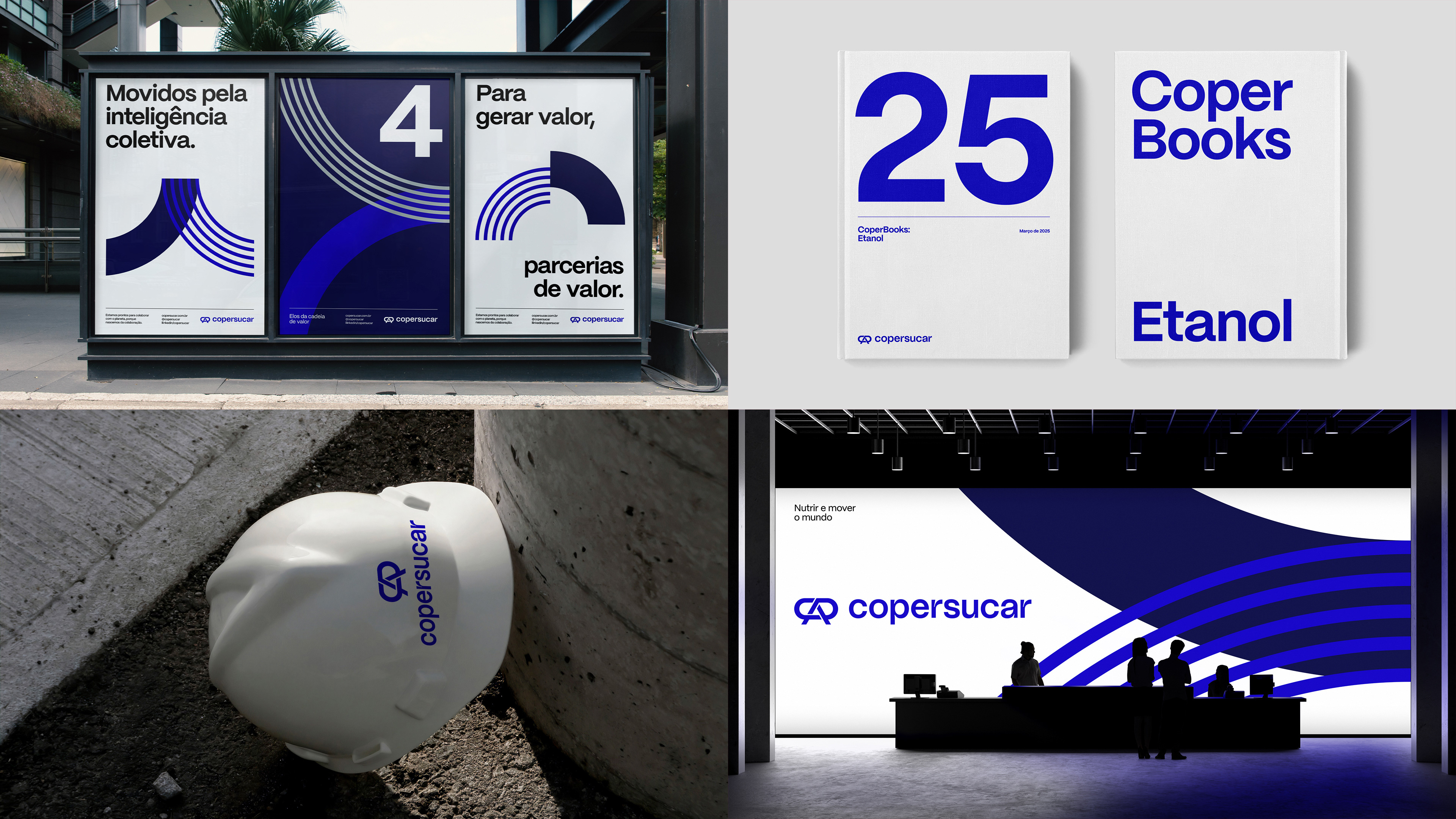
O projeto foi guiado por um insight central: a Copersucar opera do micro ao macro — da inteligência territorial das usinas à escala de impacto internacional.
A estratégia reposicionou a marca como Ecossistema Copersucar, um sistema vivo de soluções sustentáveis construídas em rede. A identidade verbal assumiu essa lógica ecológica, criando um ecossistema de linguagem: adaptável, potente e precisa. Um tom que cria vínculos, é direto, sem excesso, e reflete o compromisso da marca com o futuro.
[EN]
Solution
Solution
The project was guided by a central insight: Copersucar operates from micro to macro — from the territorial intelligence of the mills to the scale of international impact.
The strategy repositioned the brand as the Copersucar Ecosystem, a living system of sustainable solutions built in network. The verbal identity embraced this ecological logic, creating a language ecosystem: adaptable, powerful, and precise. A tone that creates bonds, is direct, without excess, and reflects the brand’s commitment to the future.
[PT]
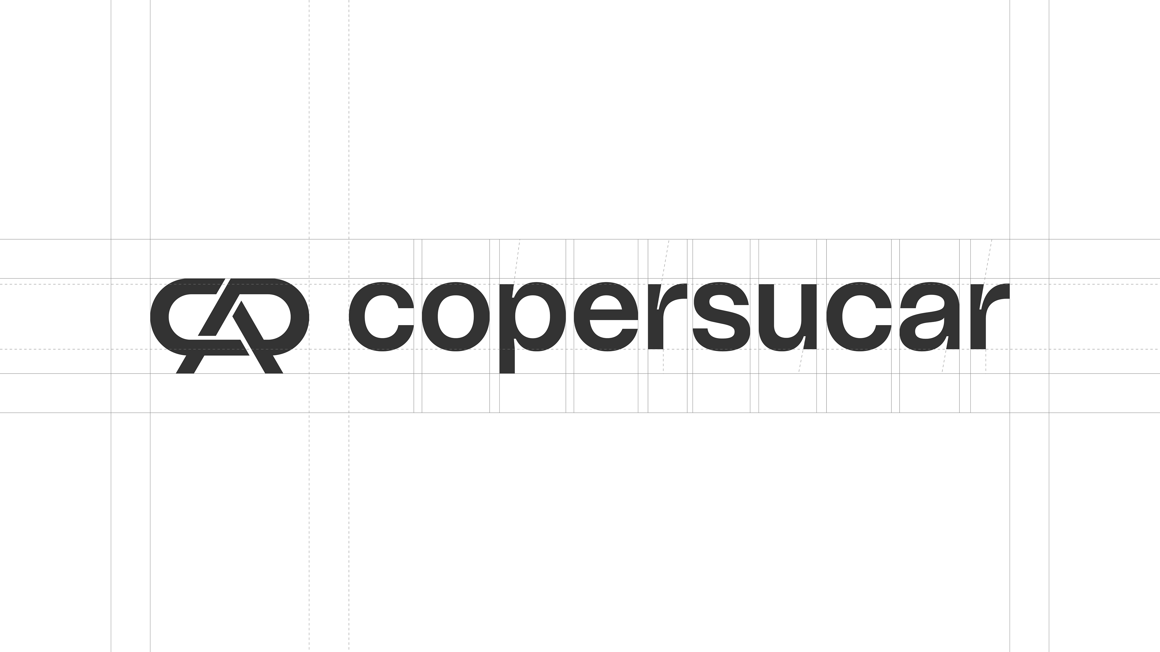
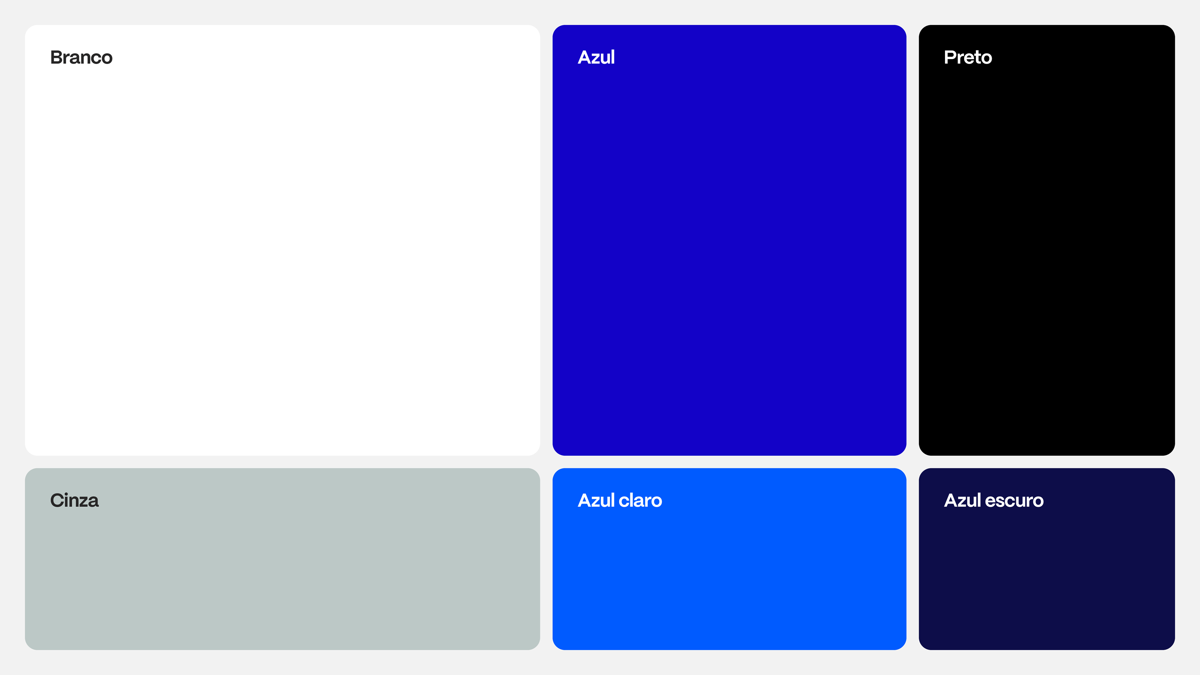
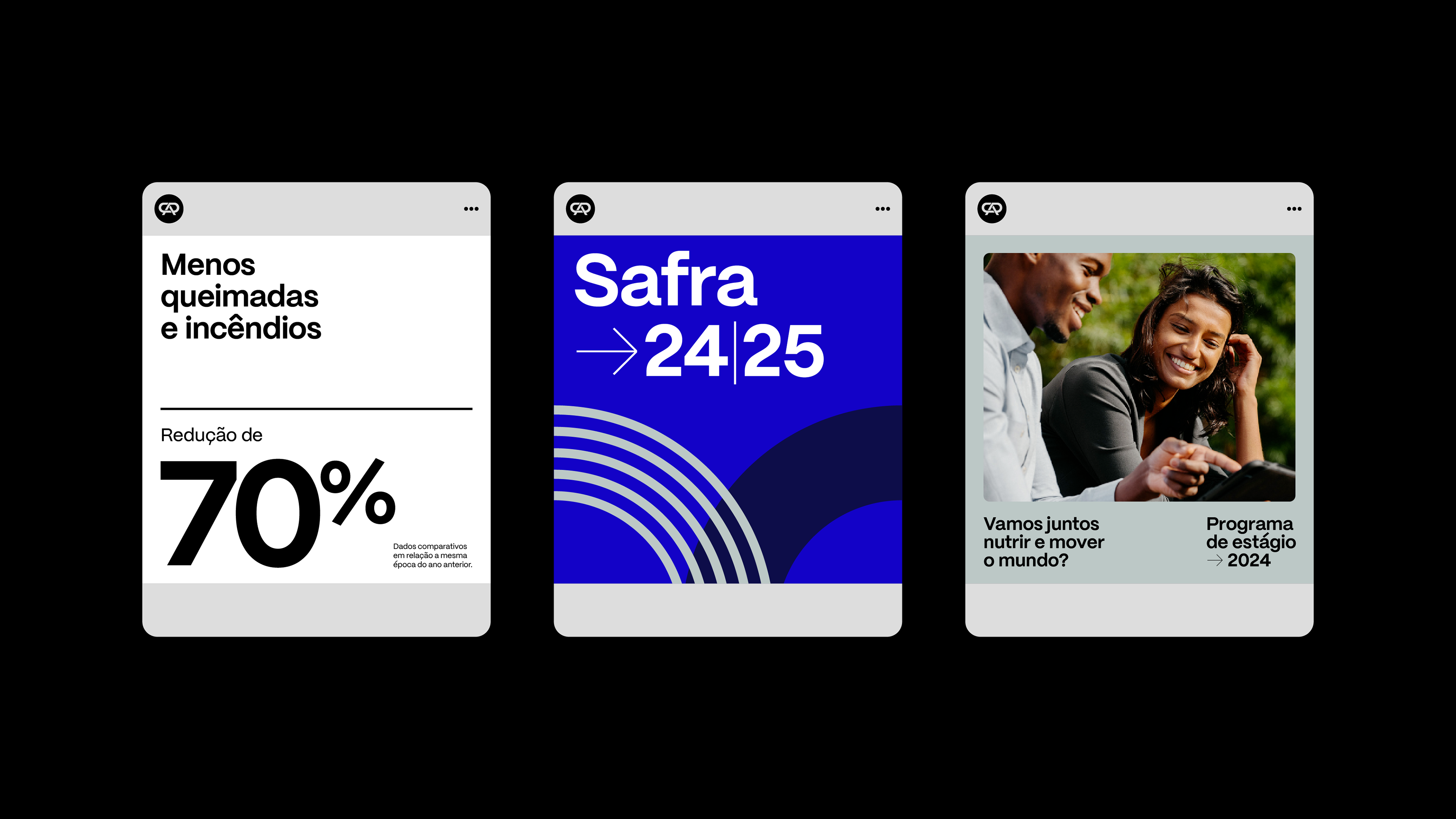
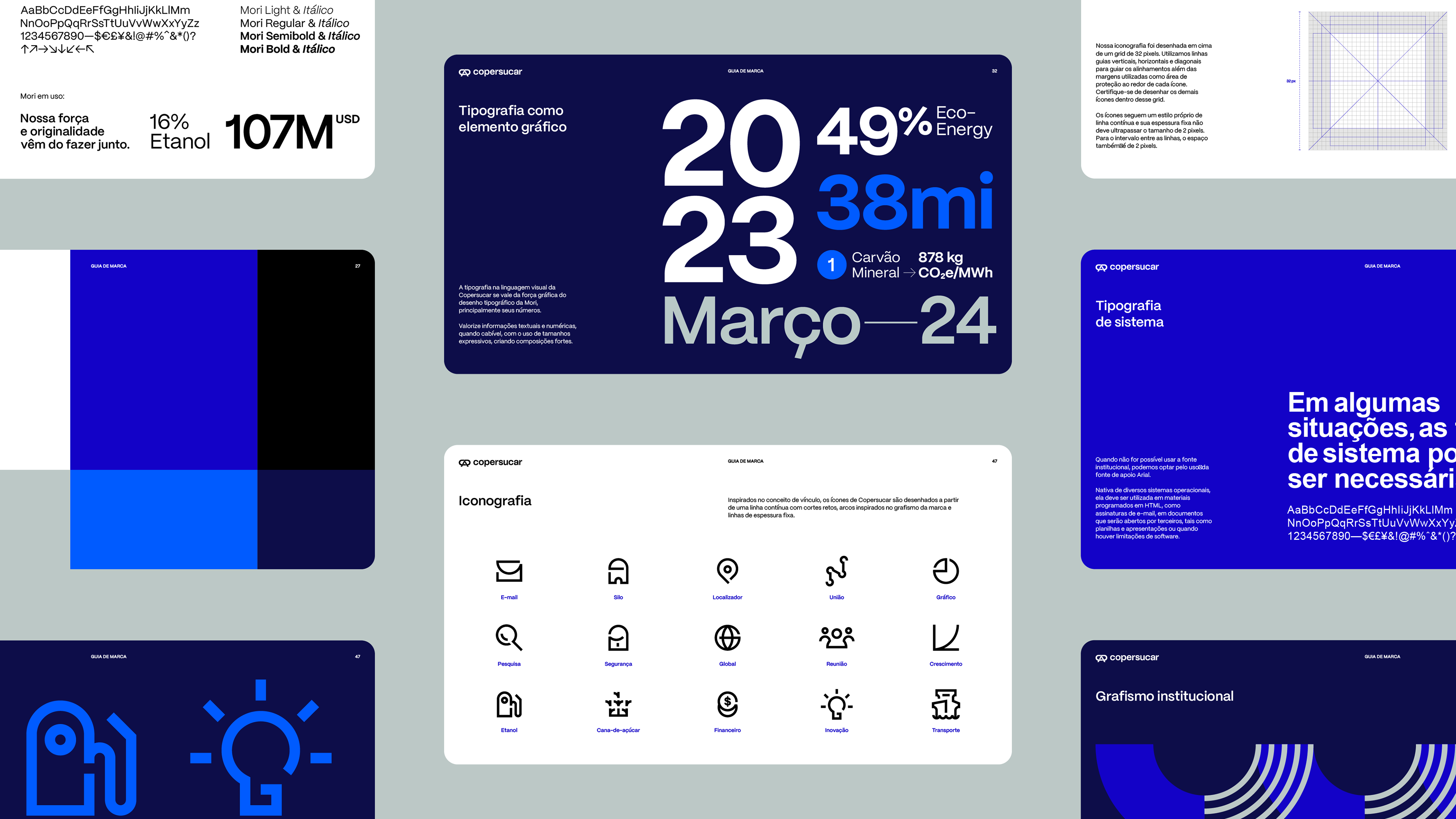
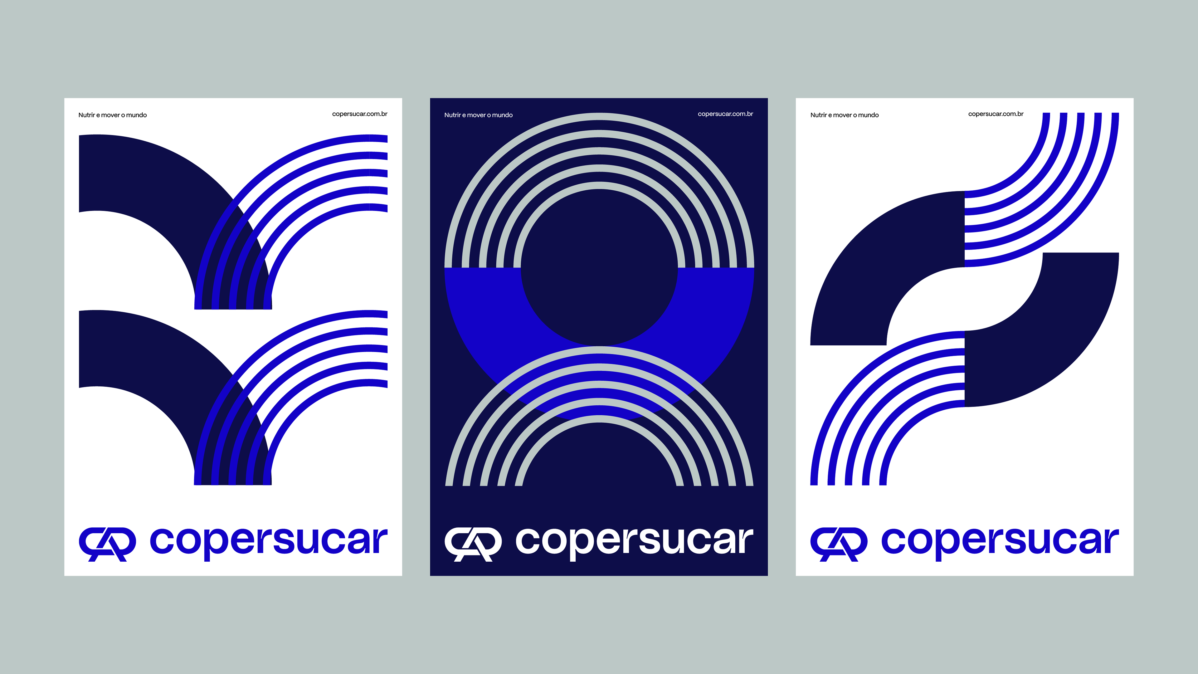
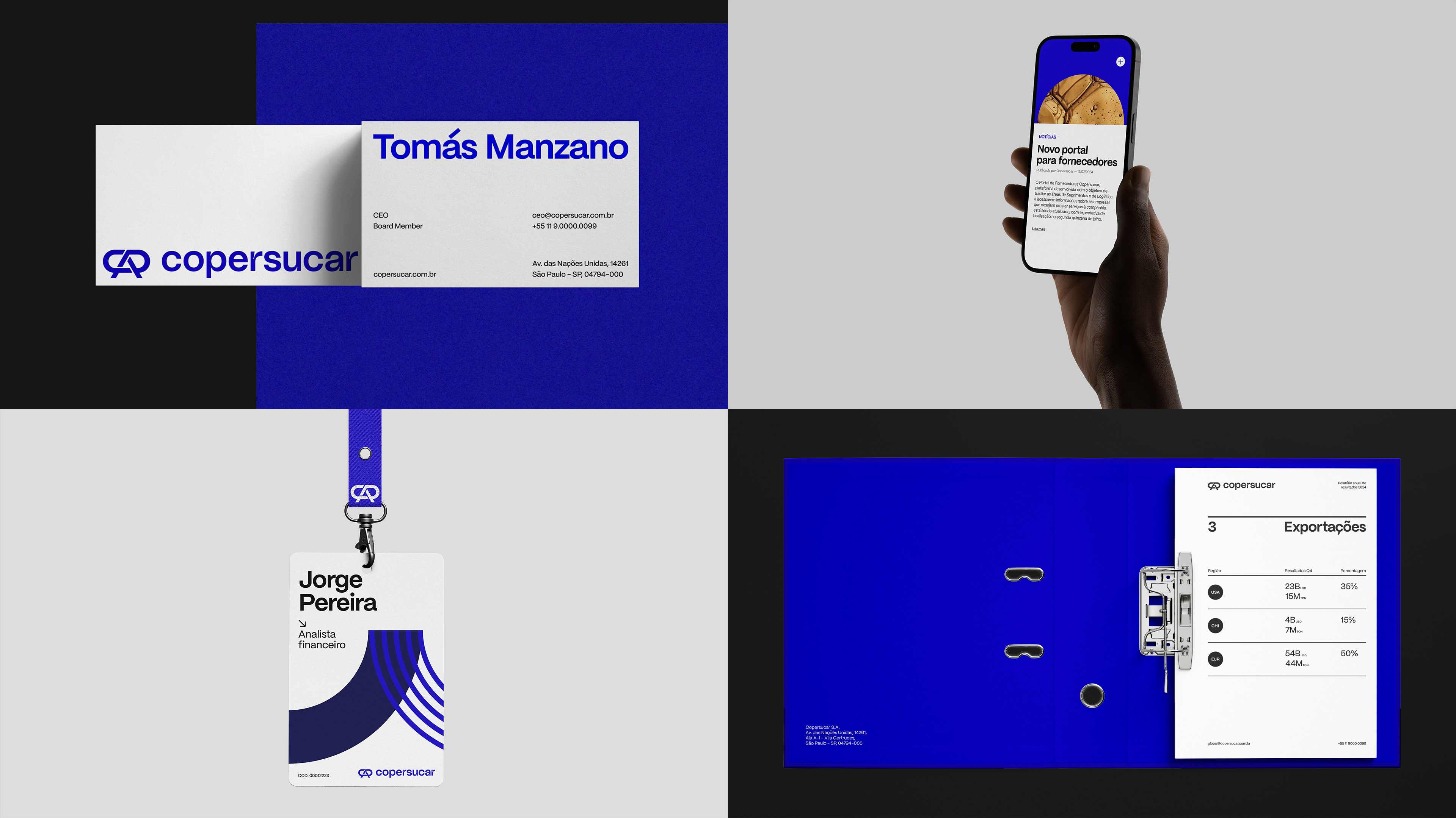
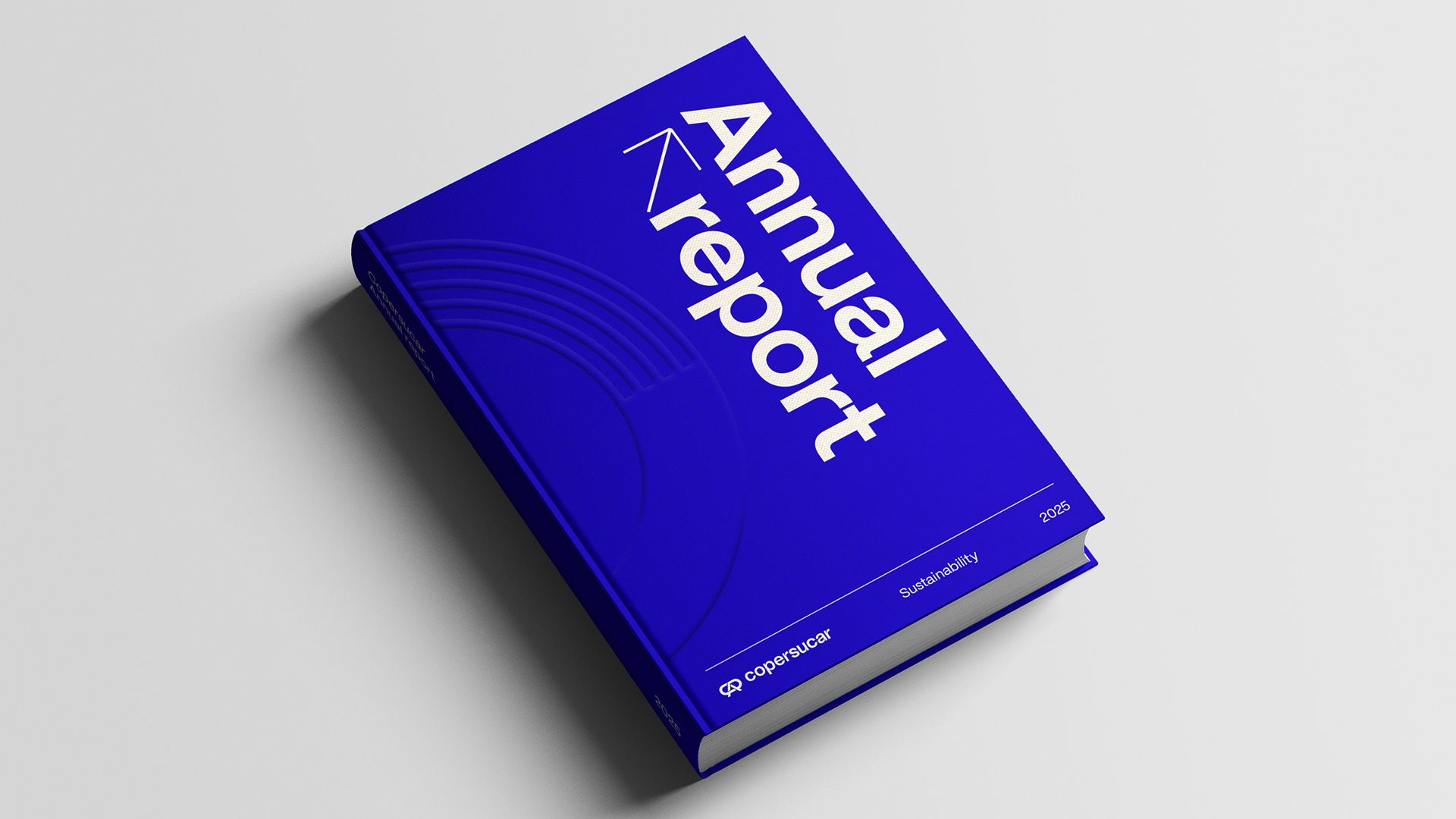
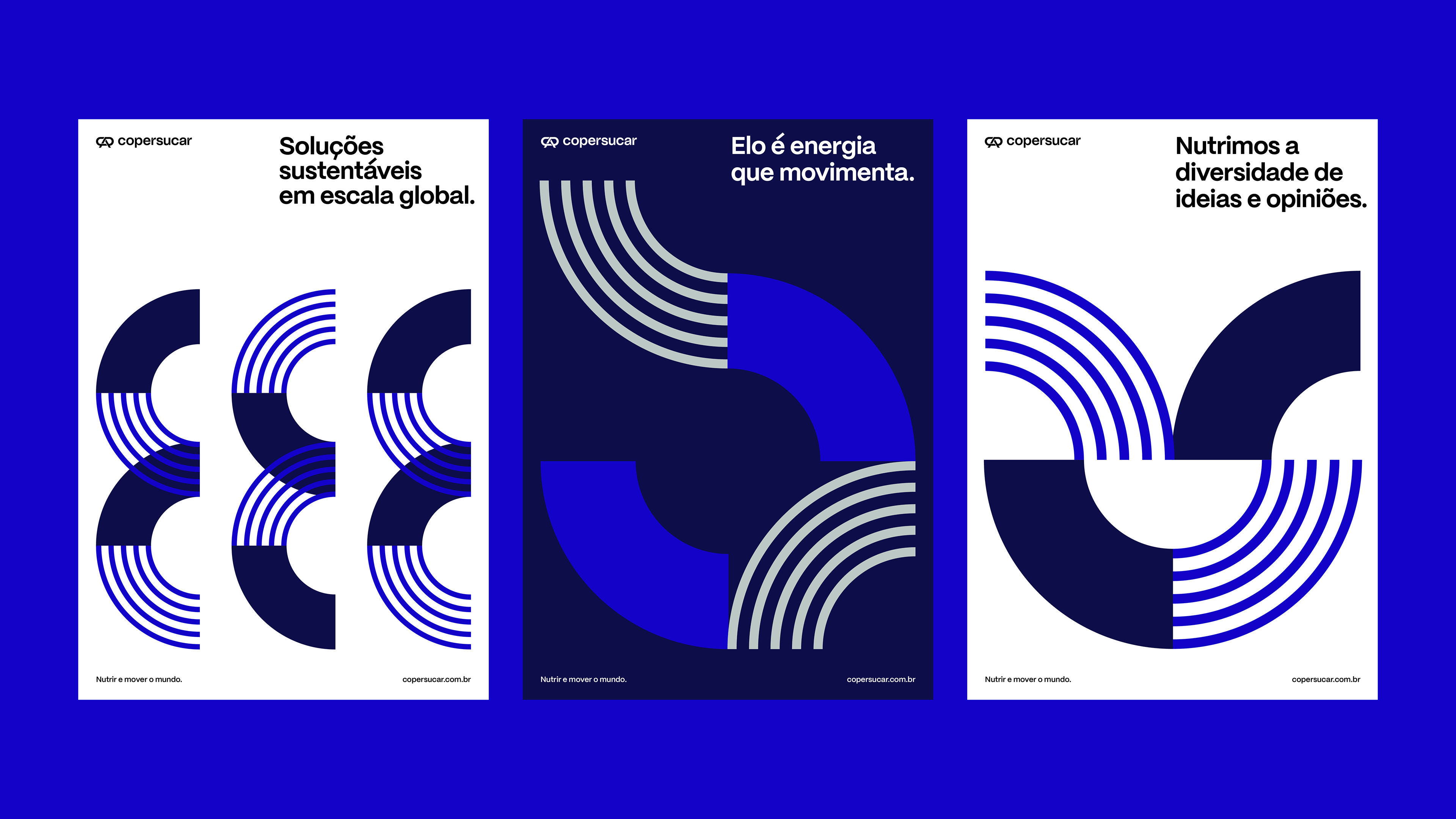
Na identidade visual, formas, cores e composições traduzem essa energia cooperativa com sofisticação e presença. Os grafismos traduzem os conceitos de cooperação e fluidez através dos vínculos gerados pelas formas e do movimento constante. Da linguagem verbal aos números, a tipografia reforça a personalidade da marca trazendo precisão e versatilidade.
O resultado é uma marca mais clara, sólida e conectada com seu tempo — capaz de comunicar com força tanto para investidores quanto para a sociedade.
Mais do que uma mudança de marca, um redesenho de futuro.
[EN]
In the visual identity, shapes, colors, and compositions translate this cooperative energy with sophistication and presence. The graphics convey the concepts of cooperation and fluidity through the connections generated by the forms and constant movement. From verbal language to numbers, typography reinforces the brand’s personality by bringing precision and versatility.
The result is a brand that is clearer, stronger, and more connected with its time — capable of communicating with strength to both investors and society.
More than a brand change, a redesign of the future.
Ficha Técnica
Copersucar
Copersucar
Direção Criativa | Creative Direction
Daniel Souza
Estratégia | Strategy
Carolina Polli, Letizia Trannin
Design
Mariane Silva, Patrícia Licio, Regys Lima
Motion Design
Lucas Santiago
Conteúdo | Copywriting
Ingrid Taveira, Vallécia Carvalho
Business | Negócios
Jessica Moura, Thaiz Crepaldi
Produção Interna | Intern Production
Valéria Forte
Com & Mkt & Brand Tátil | Comm & Mkt & Brand Tátil
Luiza Magalhães, Marcelo Cândido